
Community Couriers is a community based courier service for community businesses and community members. I started working with the founder a couple of years ago and we have worked on numerous projects together since.
Community Couriers was a new project he had in mind due to the increase in online purchases during the lockdown, the expensive prices of on demand deliveries and the unreliable date & time of deliveries in South Africa. He needed a new logo and visual identity for his new business. As said in the brief: "something friendly but clean and that creates a warm and comforting feel"
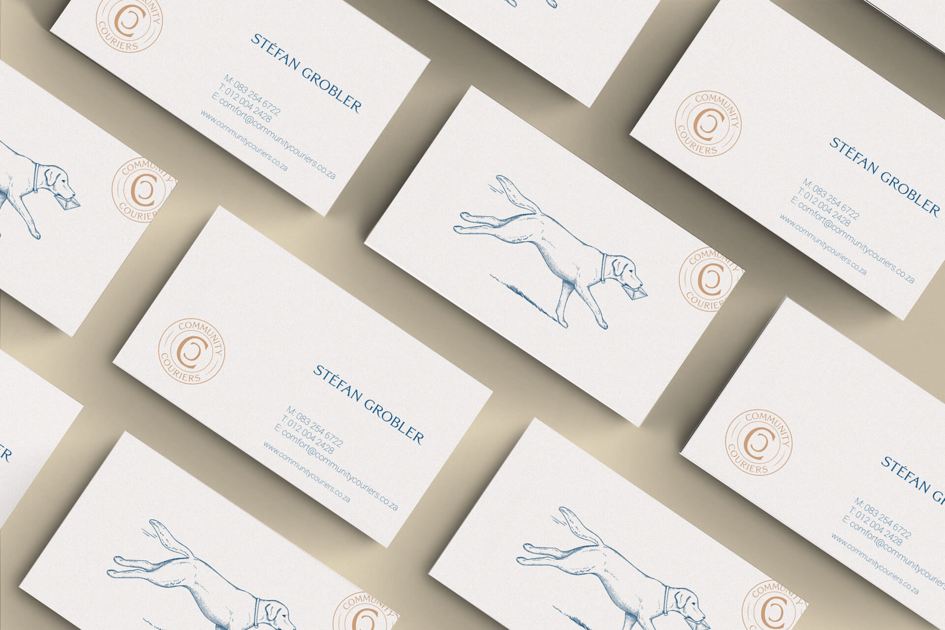
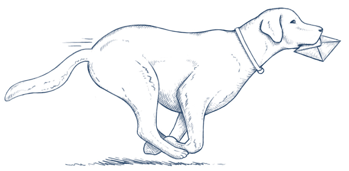
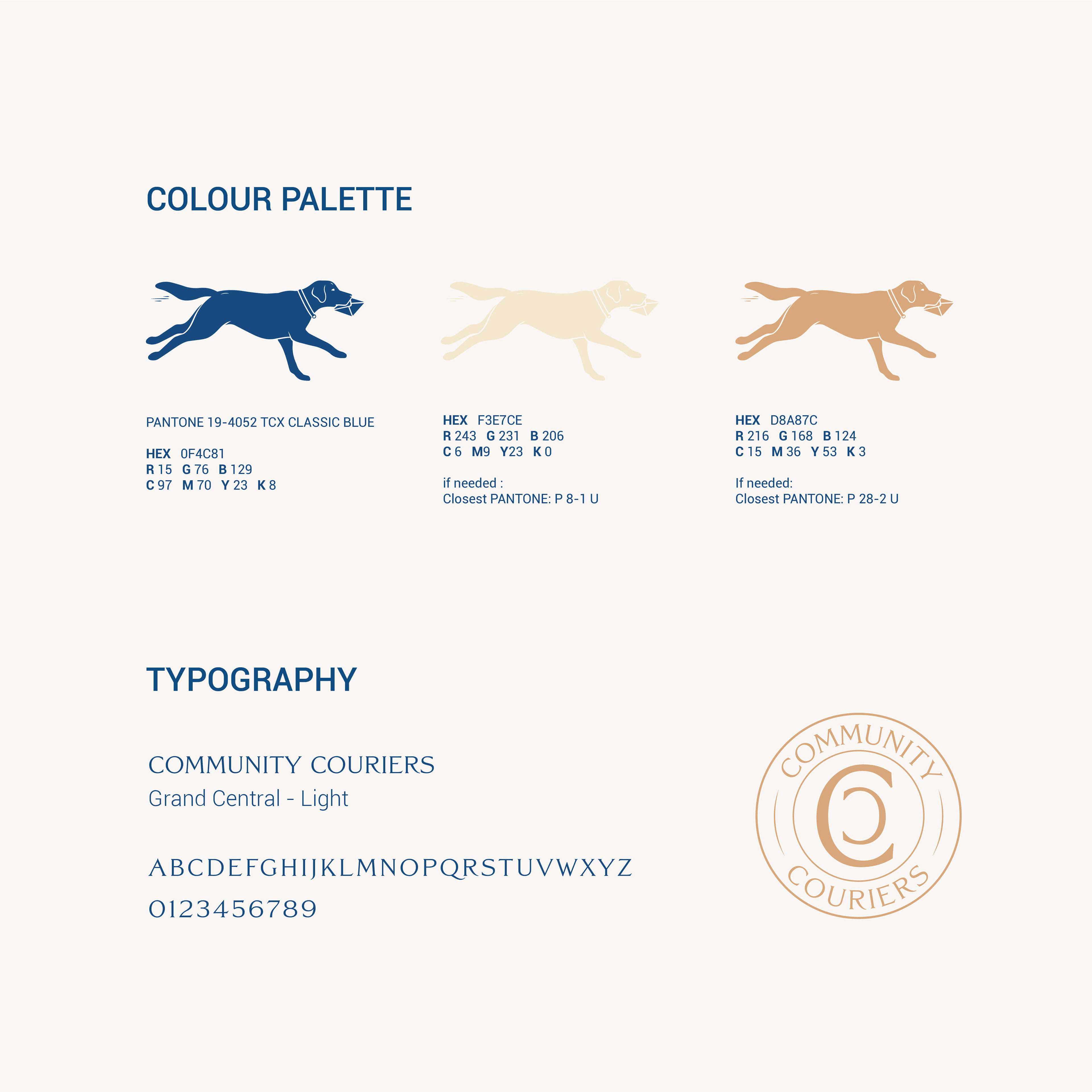
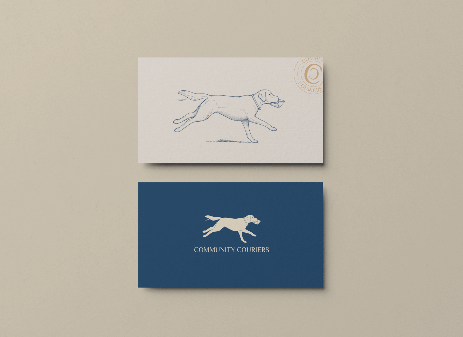
My design reflects a deep appreciation for details. I chose the Labrador as the main image because of its physique, profile, attitude and friendliness. But also because I knew the founder's love for this breed (he actually owns 2 Labradors). The animal holding the letter conveys loyalty, trust, intelligence, approachability and reliability.
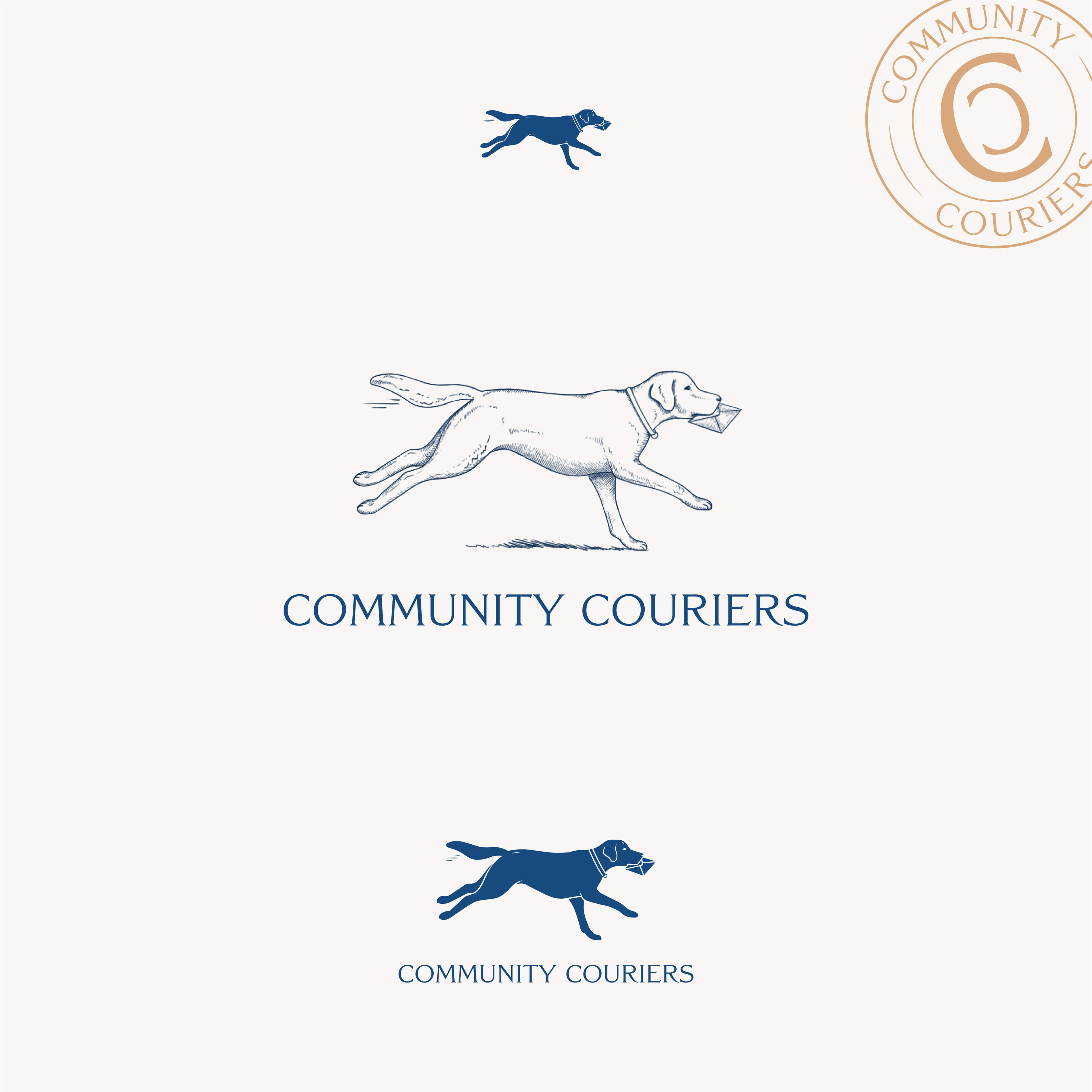
I hand illustrated the logo to expand upon the brand's friendliness, reliability and human quality.
CLIENT
Community Couriers - South Africa
PROJECT DATE
April 2020
WHAT I DID
Strategy · Visual identity · Logo · Illustration · Print · Signage
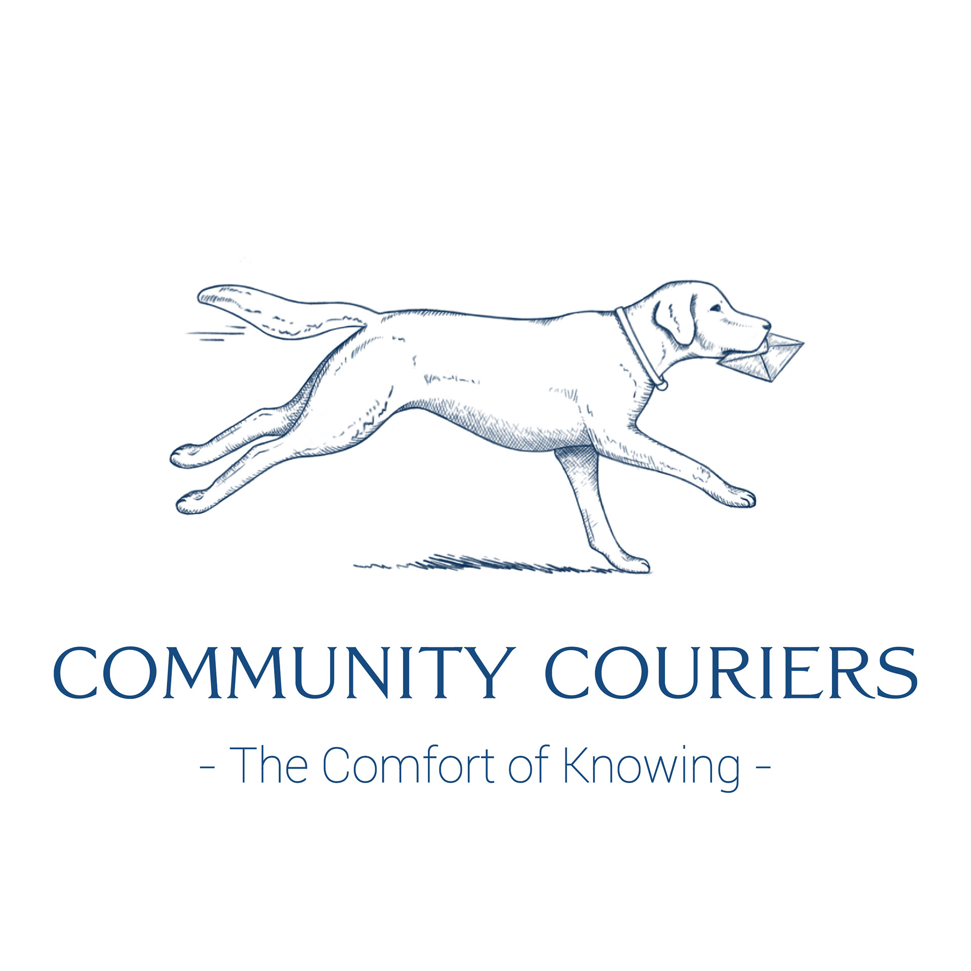
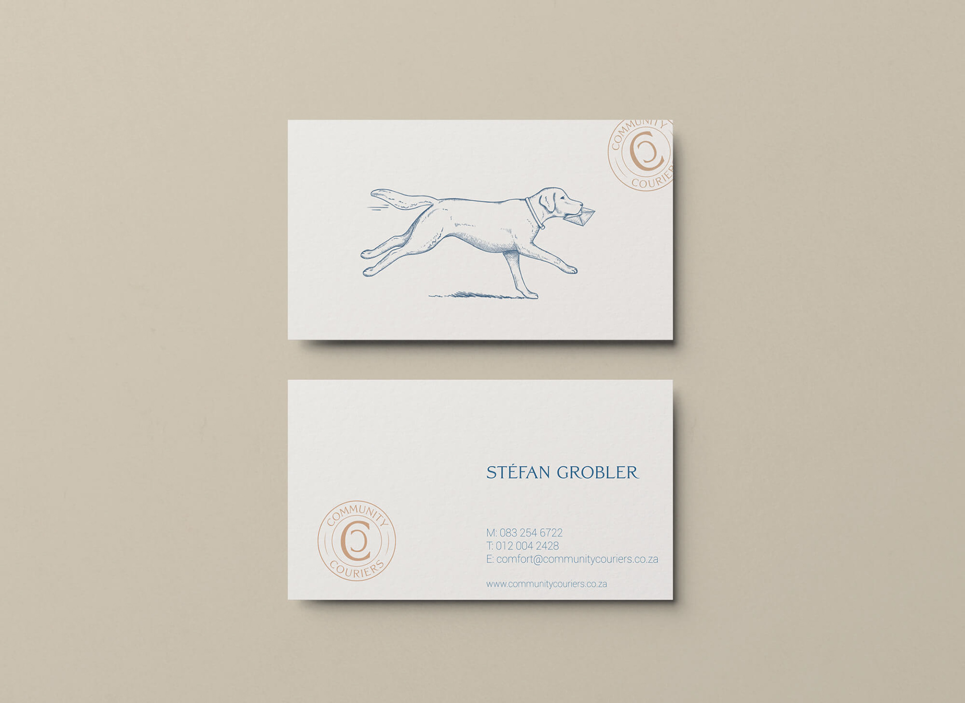
Hand-illustrated logo for Community Couriers: the animal holding the letter conveys loyalty, trust, intelligence, approachability and reliability
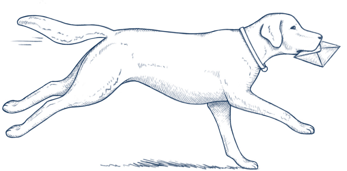
I first illustrated 2 versions of the Labrador (see below). They decided to go with the left option.
Quick gif using the 2 illustrations I initially drew.