
Organocare is a cosmetic brand developed by the Department of Plant and Soil Science at University of Pretoria. The brand aims at developing cosmeceutical products from South African biodiversity through ethical sourcing collaborations. Knowledge holders and local community members form an integral part of the brand to ensure skills development, transfer of knowledge and job creation. A percentage of the sales made goes to the communities involved in the project.
The project's goal was to rebrand the 7 cosmetic prototypes as it was clear that the brand needed to revisit their identity in order to reflect their vision. The challenge was to express all the aspects of the brand through the packagings (labels and boxes): the packaging had to be friendly and cheerful but also serious and sophisticated. It must convey that these products come from a natural source (plants), that the products were developed because of a collaboration between indigenous knowledge and science and show values of community and empowerment.
I created 3 design proposals. As the products are still prototypes at this stage and only used for display purposes, all 3 proposals have been chosen to rebrand the range. The first and third option were selected for 3 products each and the second option for one product.
CLIENT
University of Pretoria - South Africa
PROJECT DATE
October 2020
WHAT I DID
Concept creation · Packaging · Vector illustrations · Digital illustrations
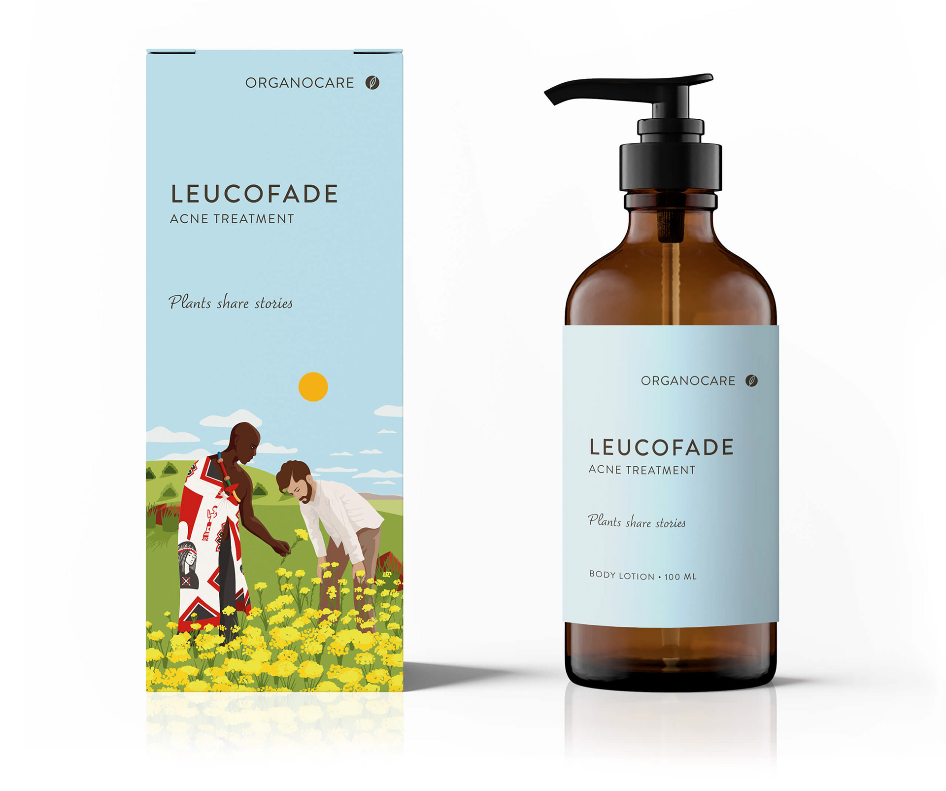
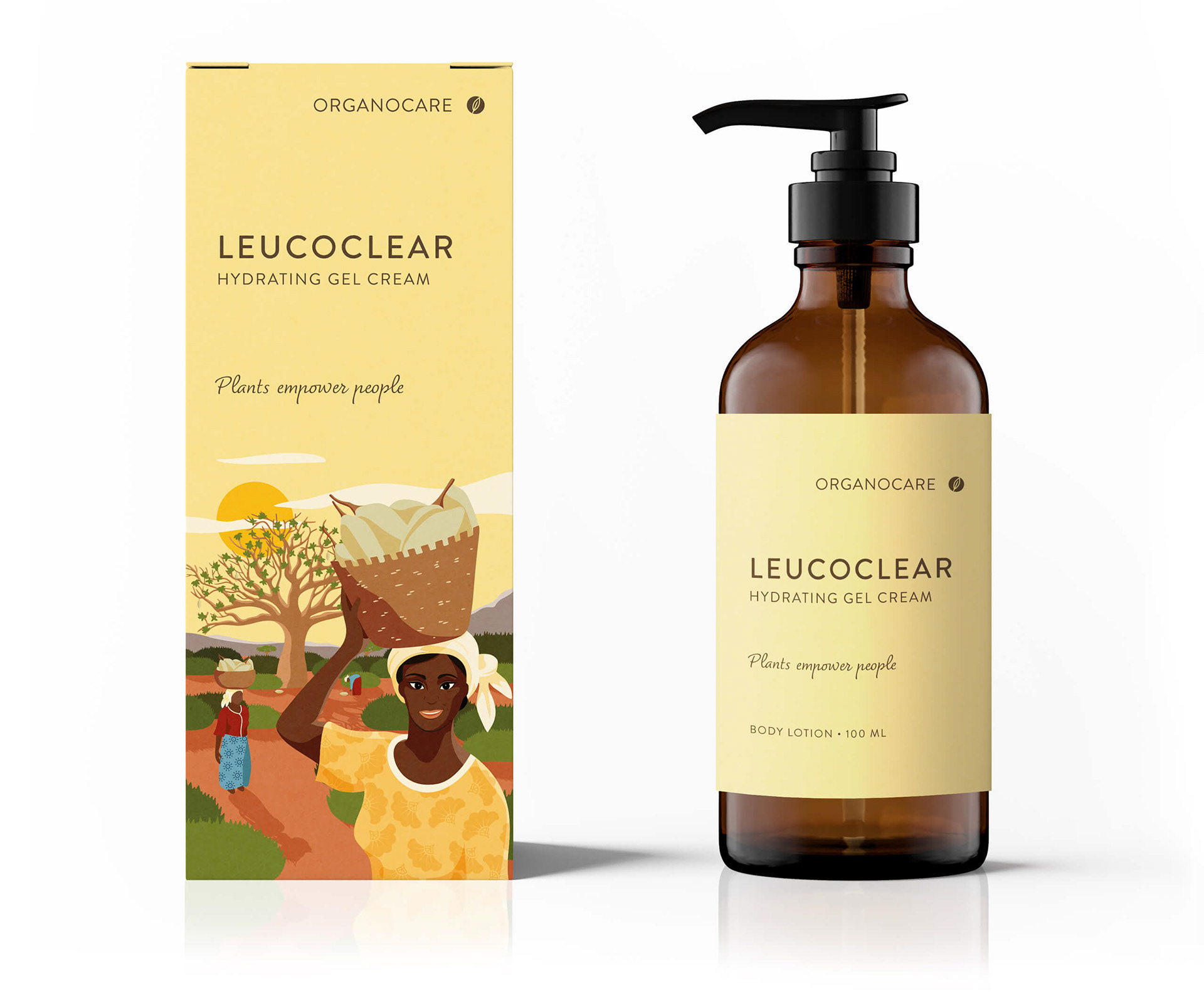
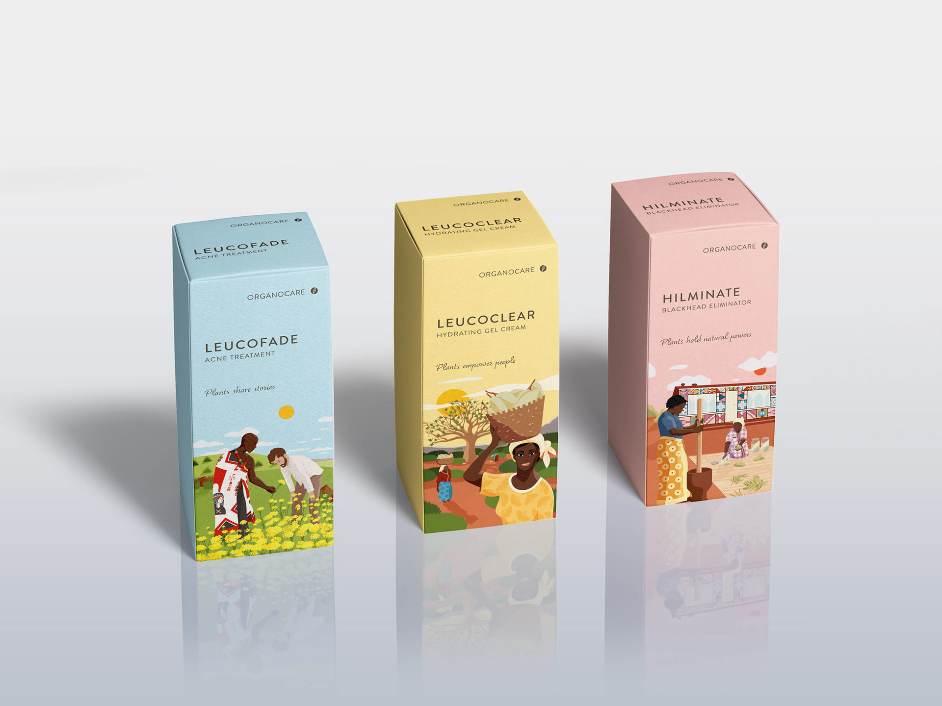
Design option 1
The logo represents the letter "O" of Organocare and includes a hand-illustrated leaf, which conveys natural/organic source, friendliness, accessibility and knowledge.

This range of packaging showcases the actual story behind the products. Each product is represented by a scene = a step of the project. There are 7 products so 7 steps. At the end, all packaging put next to one another will tell the collective story in a panel. I ensured the continuity and harmony between the steps/scenes through the illustration and a unique colour palette. I hand illustrated the scene to expand upon the brand’s lively and natural qualities and the link between a modern community and a traditional heritage.
The packaging also showcases the unique slogan for every product conveying that plants are mystical and magical. They hold powers and secrets that are unfolded onto those that seek them. These slogans are directly linked to the scene.
Plants share stories
Plants empower people
Plants hold natural powers
Plants reveal hidden secrets
Plants evoke past memories
Plants speak to our hearts
Plants embody heritage
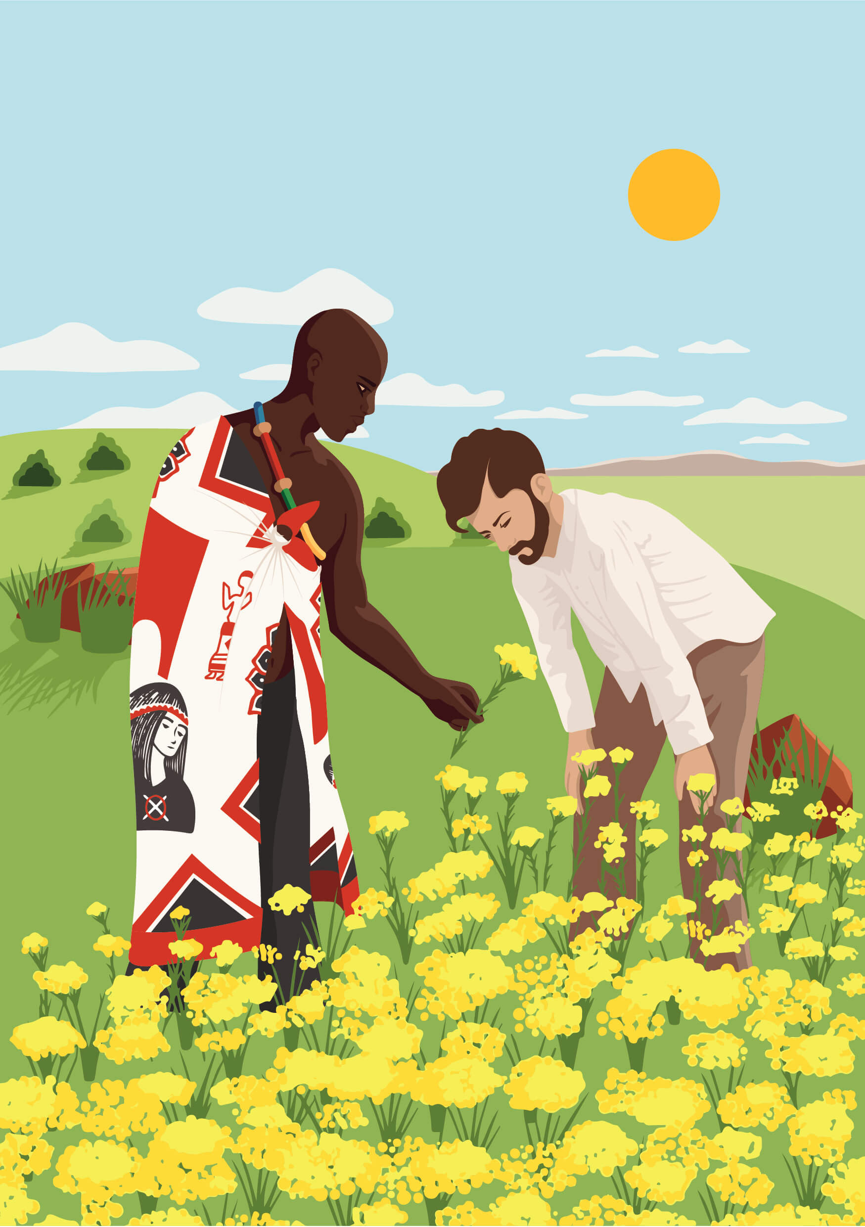
Step 1: Identification of indigenous plants with the knowledge holder from the local community

Step 2: Harvest of plants by the local community members
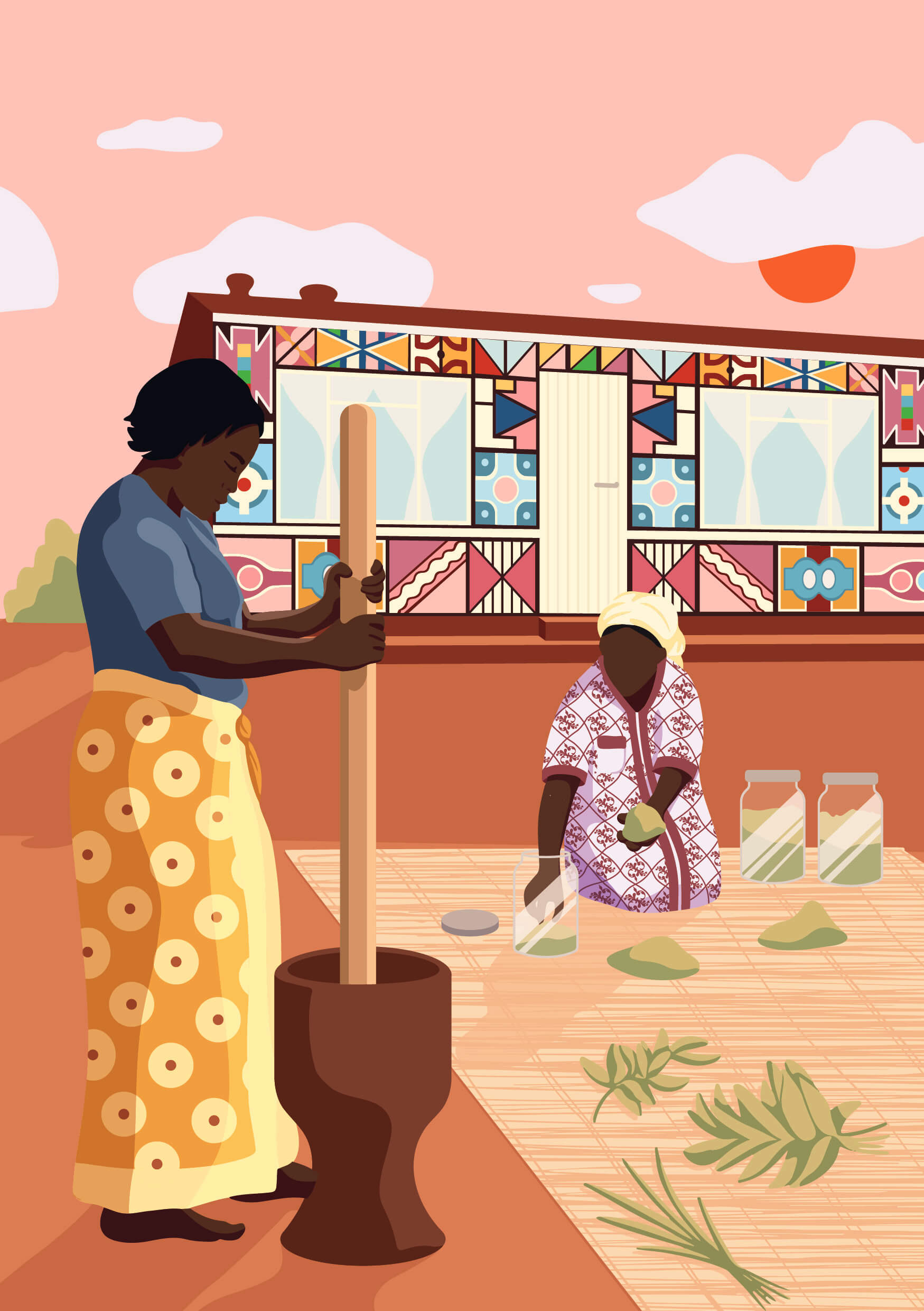
Step 3: Preparation of plants by the local community

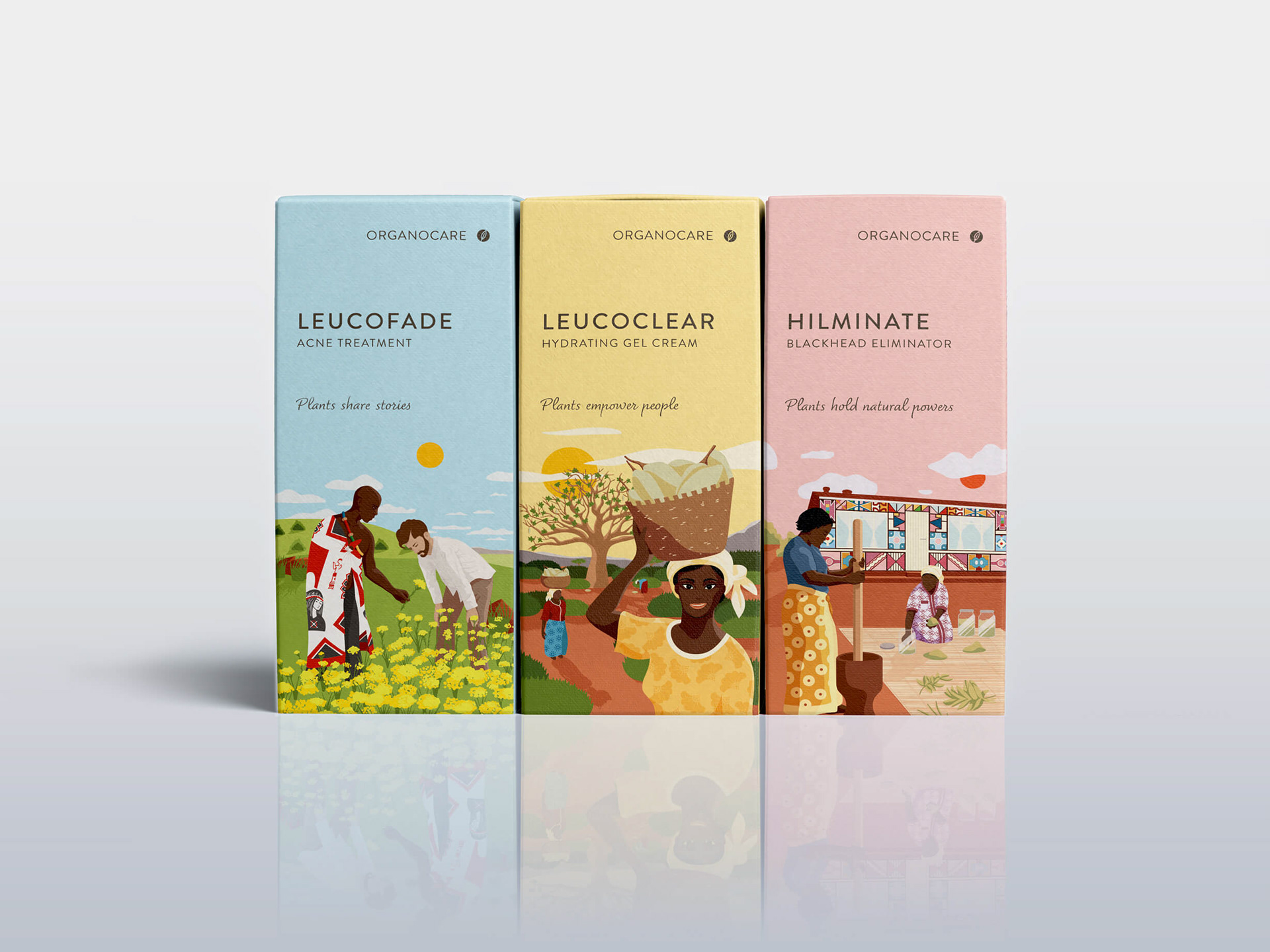
The 3 packaging put next to one another tell the collective story in a panel. I ensured the continuity and harmony between the scenes through the illustration (clouds, mountains, bush, etc) and a unique colour palette.
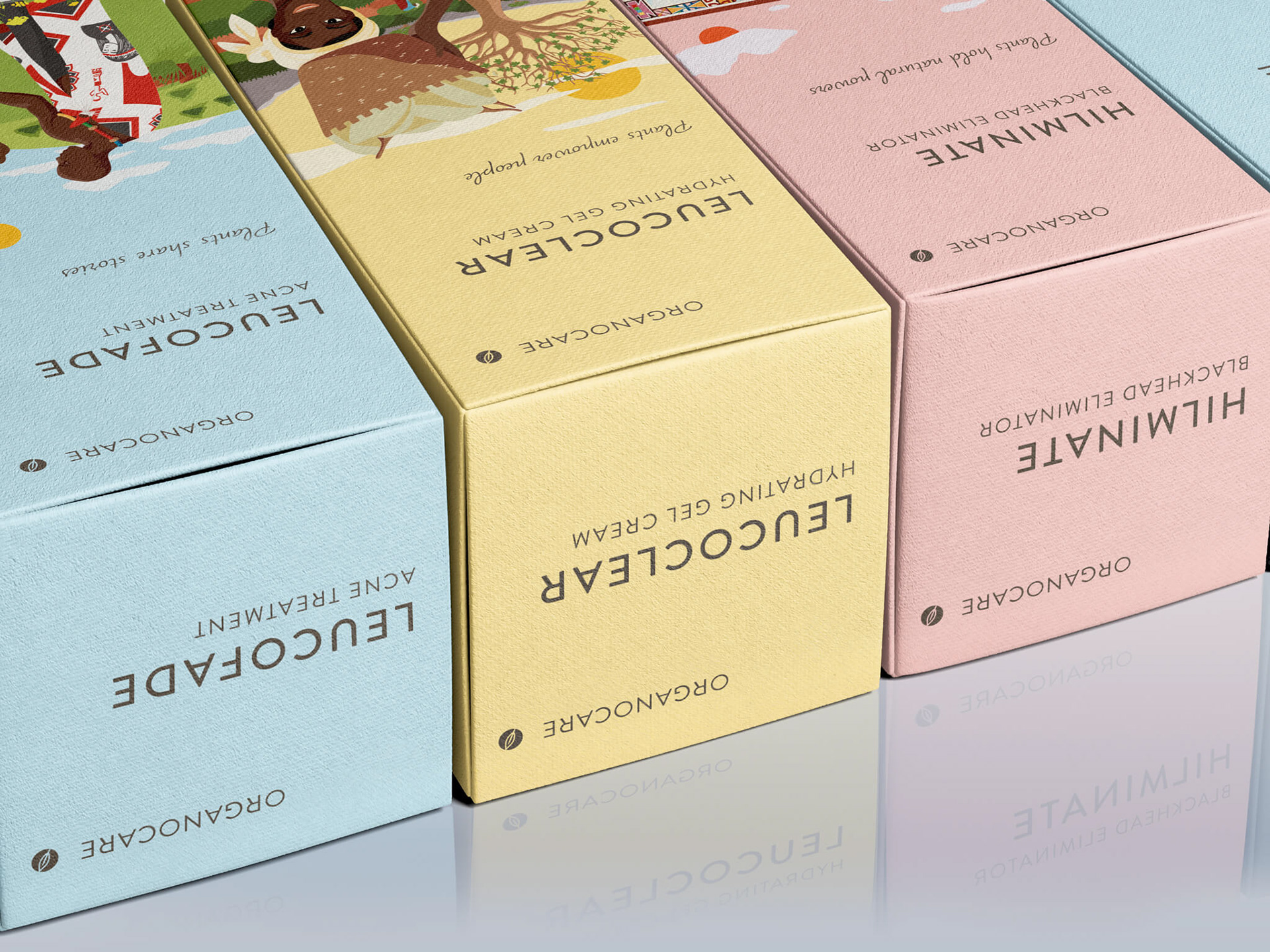
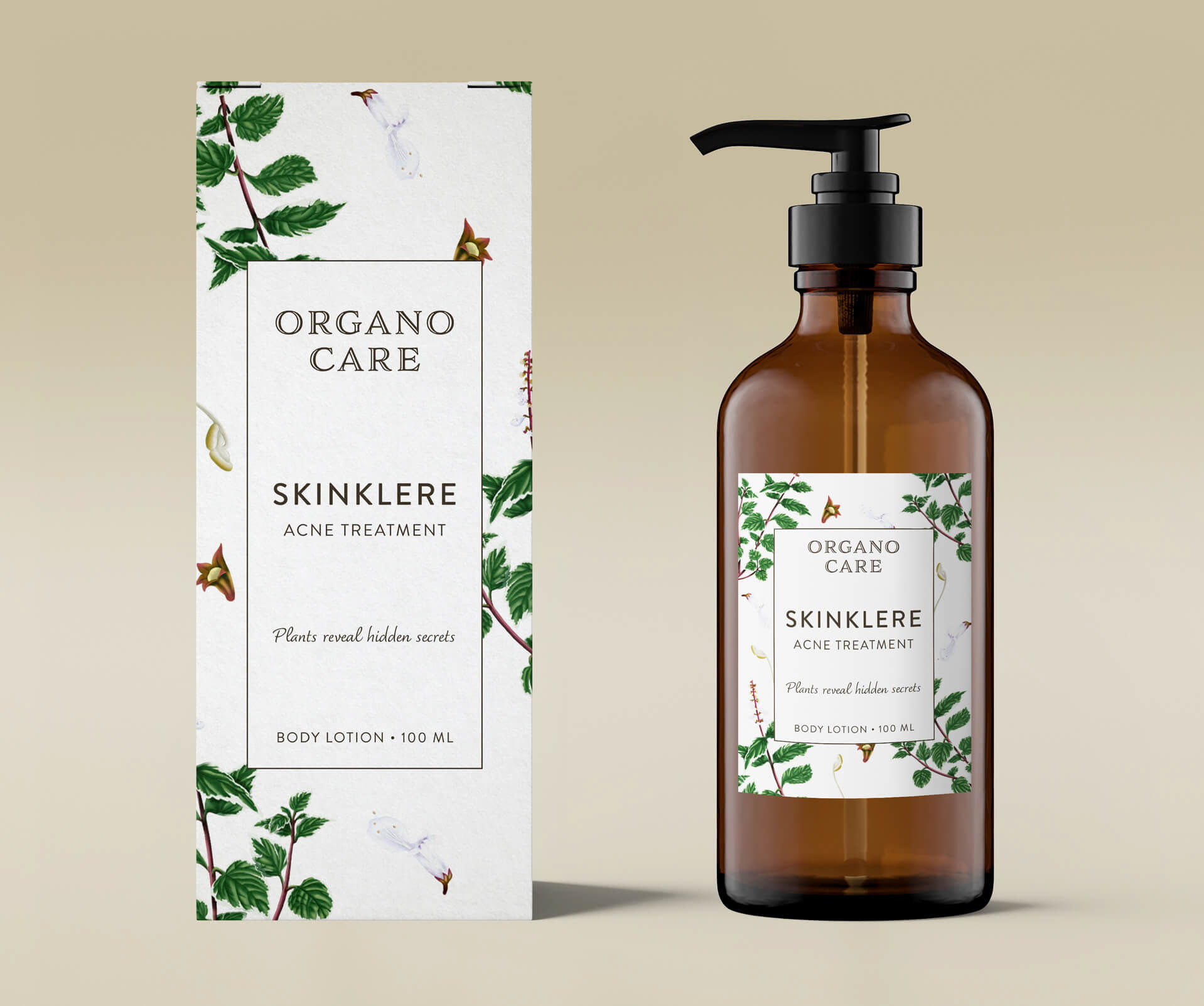
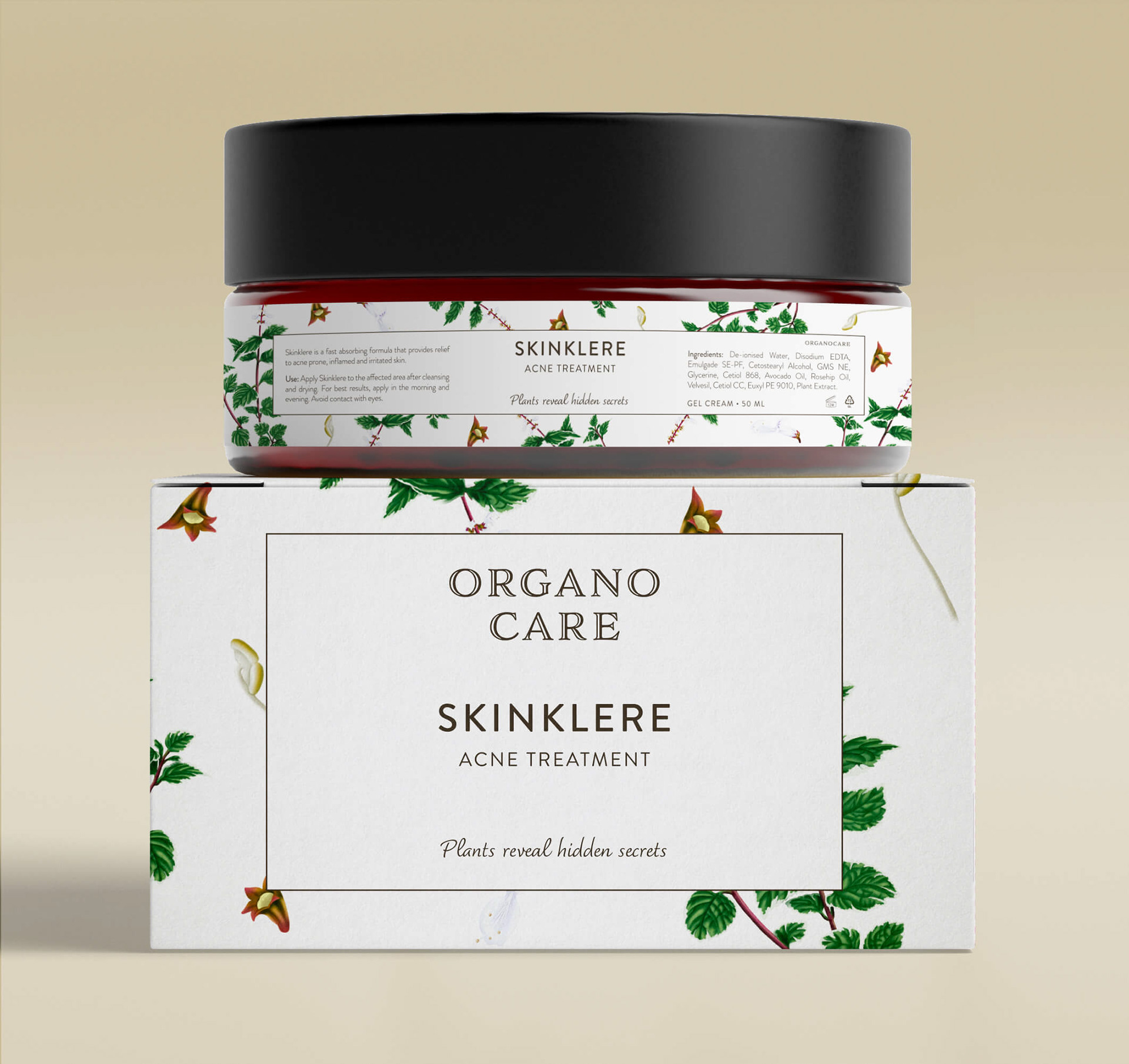
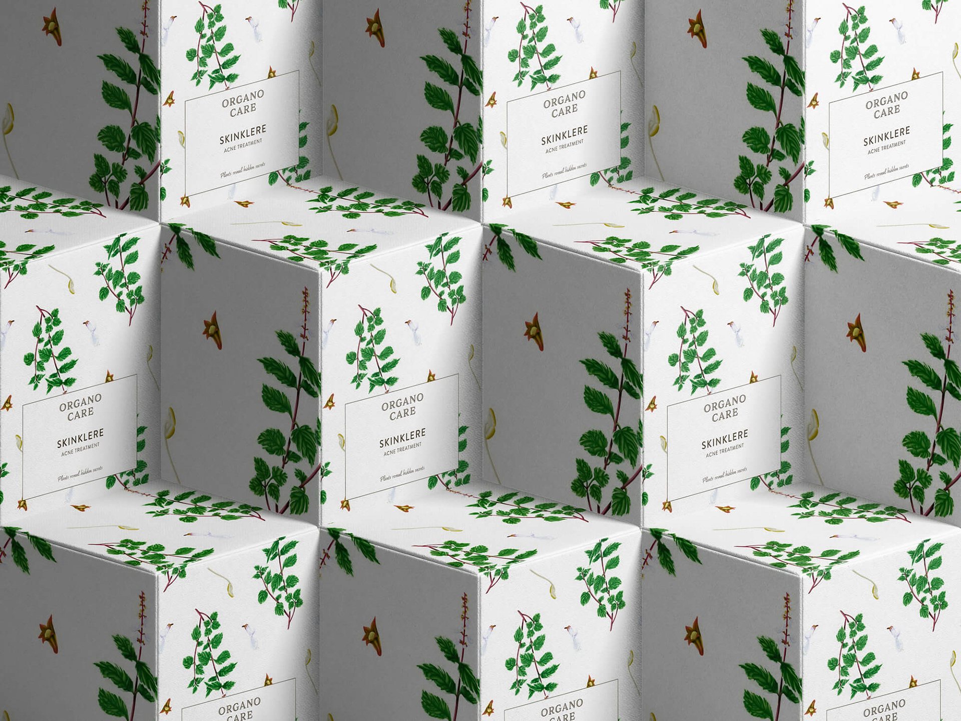
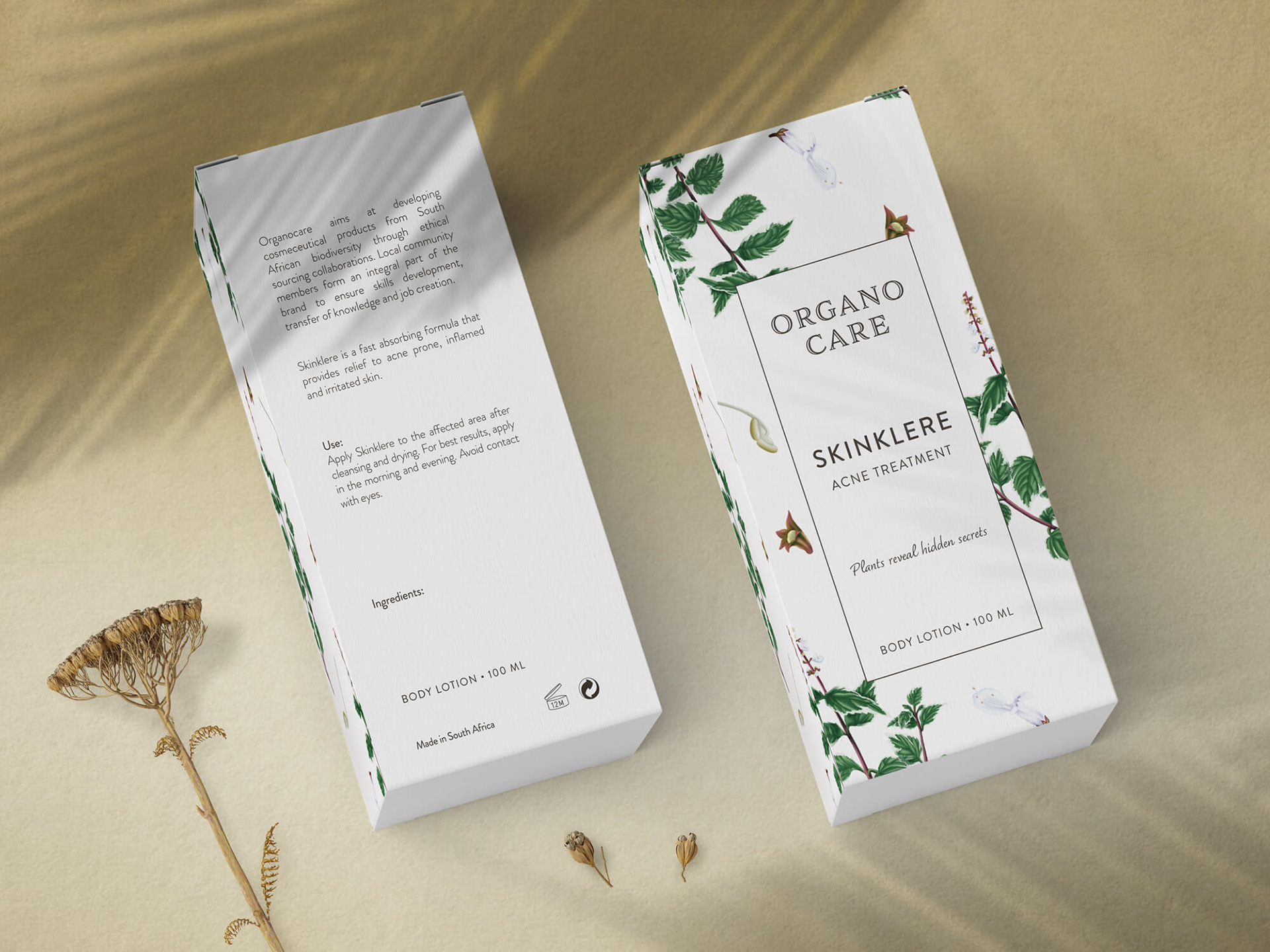
Design option 2
The logotype conveys sophistication, natural/organic source, friendliness, accessibility and knowledge.

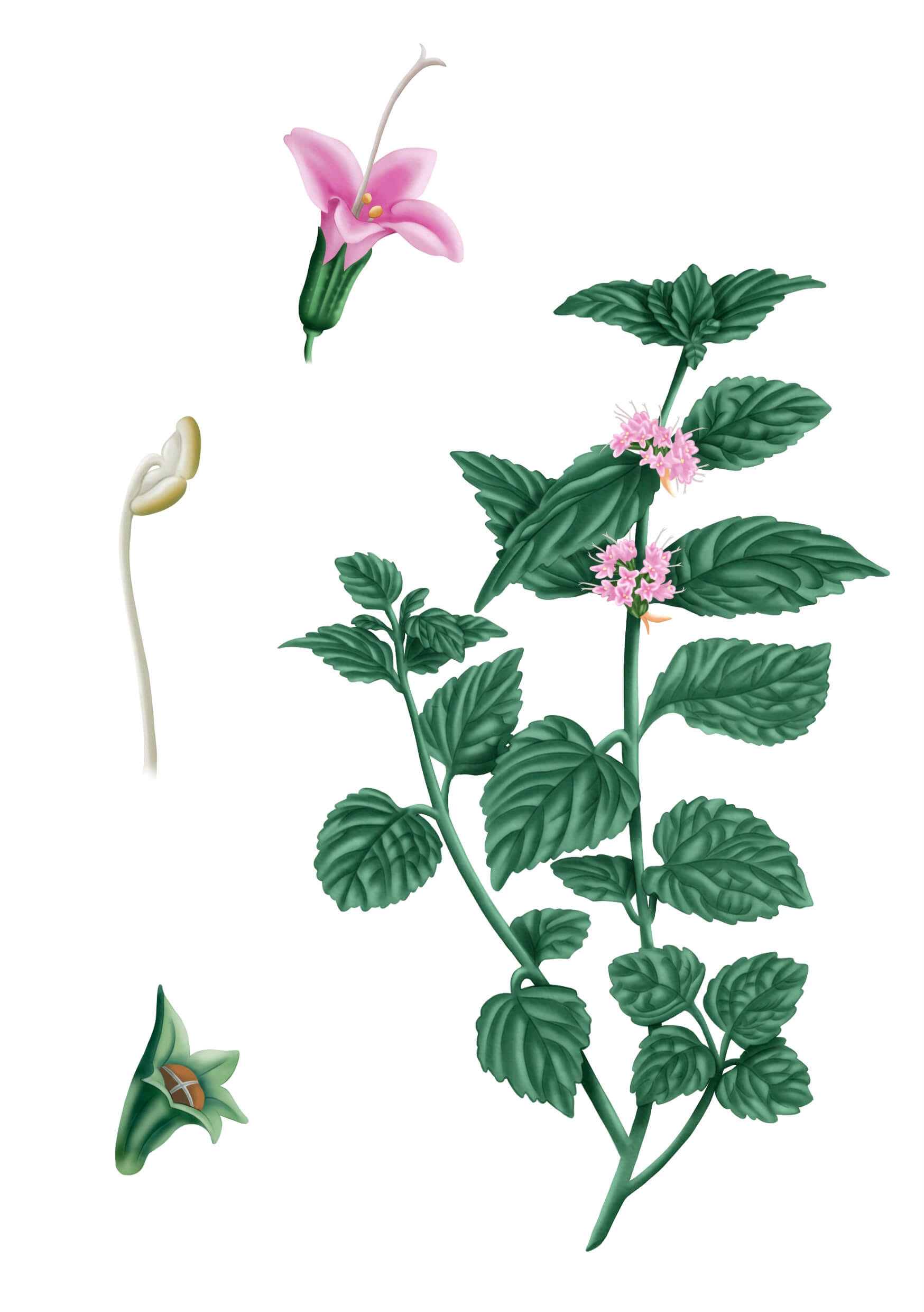
For this second option, I illustrated the packaging with medicinal plants traditionally used in South Africa. Each product showcases a different combination of plants, all in colour. Ideally, the plants represented on the product should be in the formulation. The packaging also showcases the unique slogan for every product conveying that plants are mystical and magical. They hold powers and secrets that are unfolded onto those that seek them.
I created the illustrations digitally on Procreate. As the formulation is secret, I couldn't illustrate the exact plants used in the product but plants from the same family. At the end, they decided to use only one plant (Plectranthus) to be displayed on the packaging of the product chosen for this option.
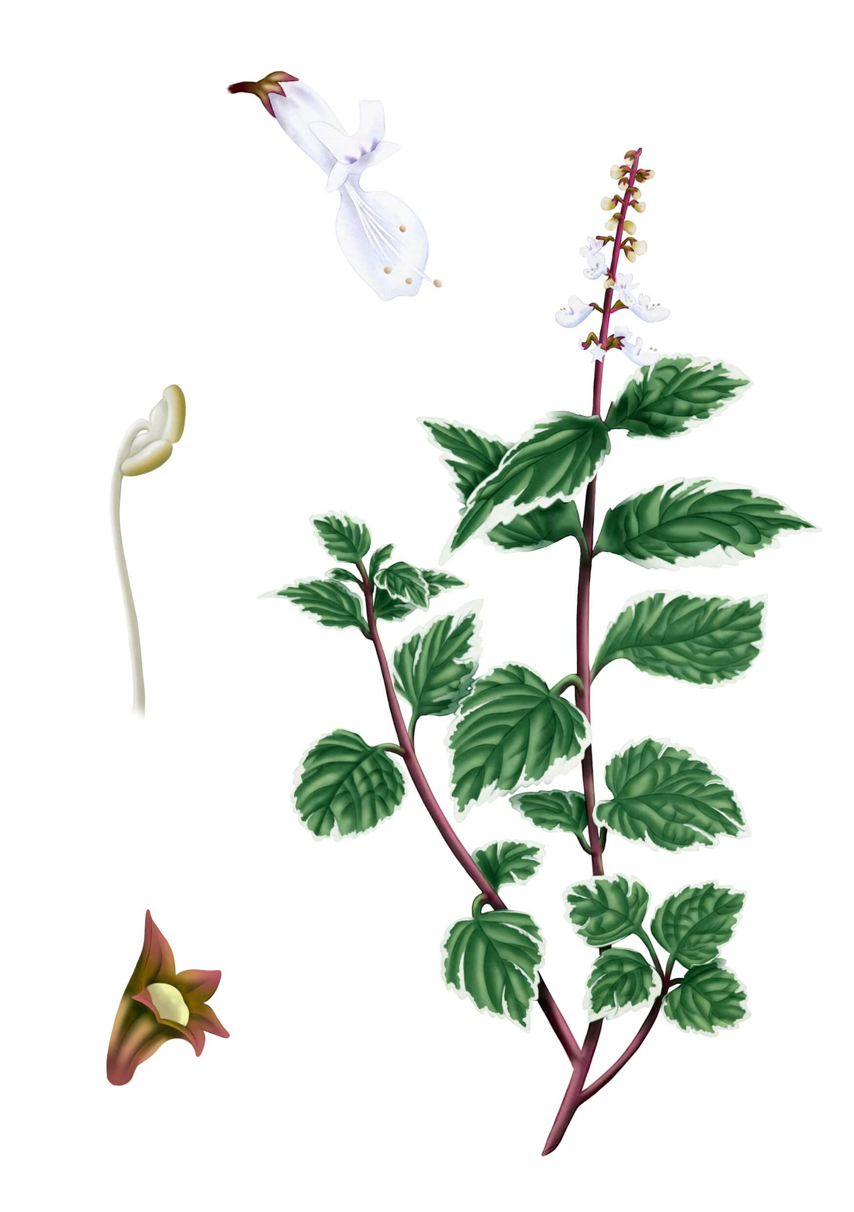
Plectranthus
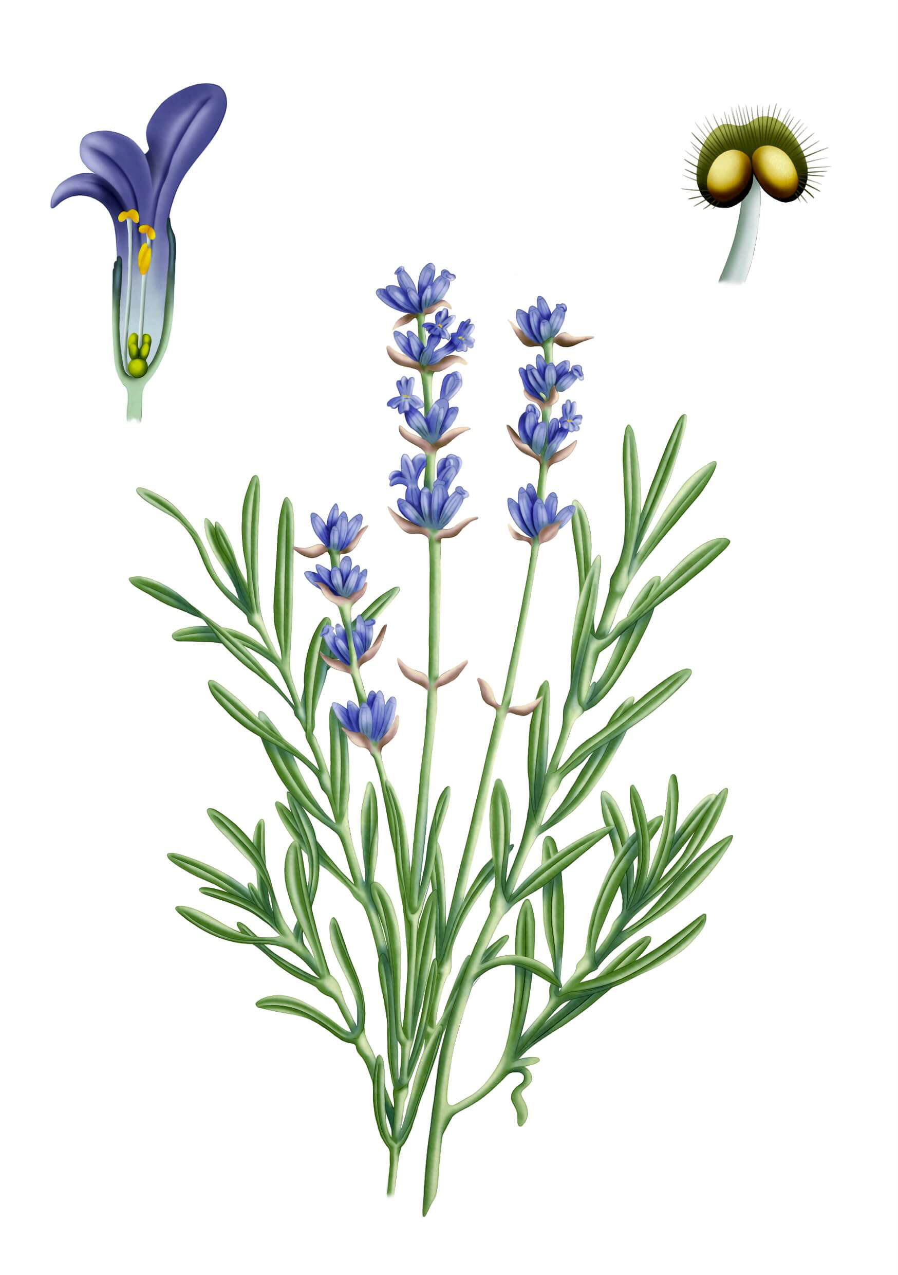
Lavender
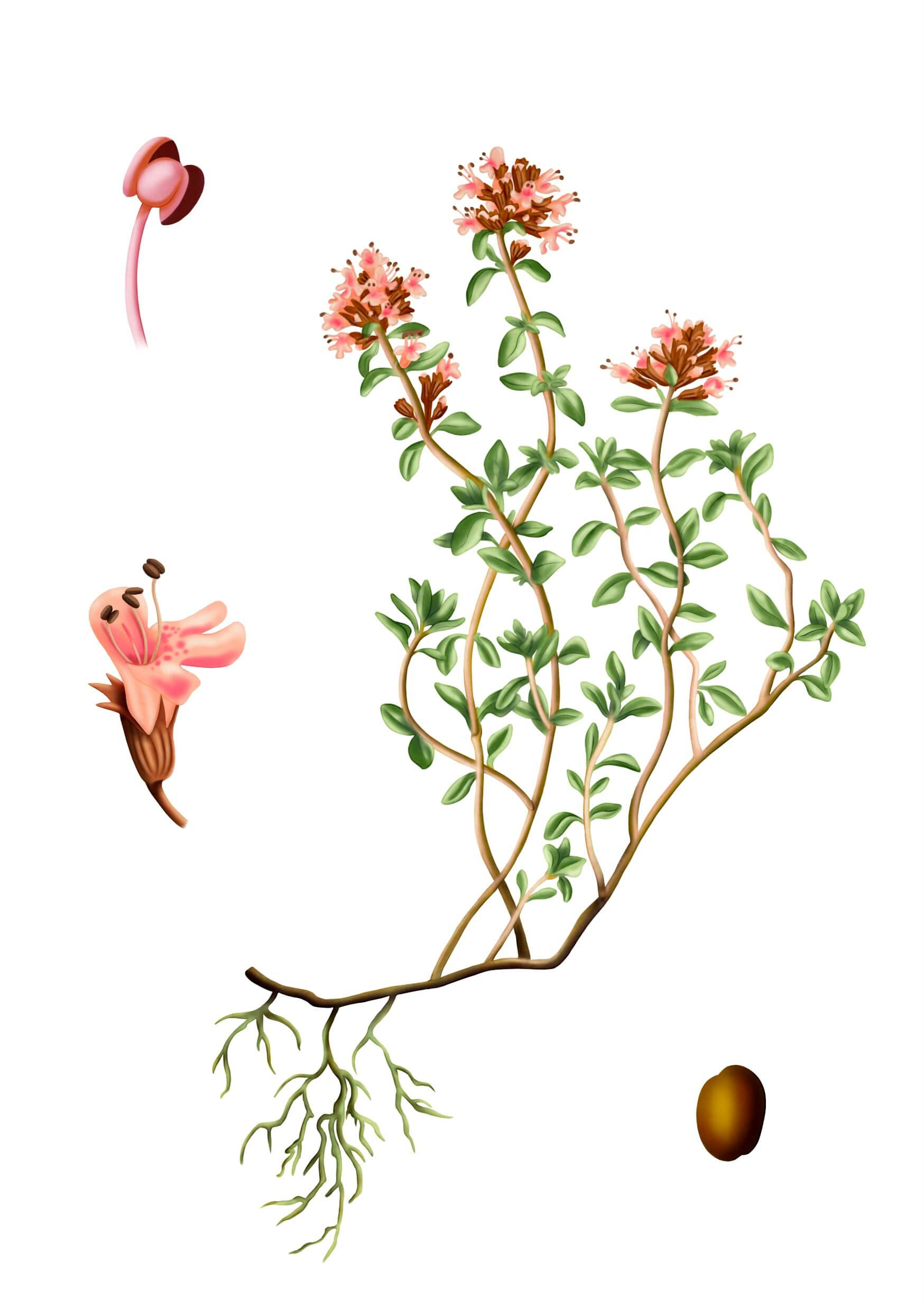
Thyme
Mint
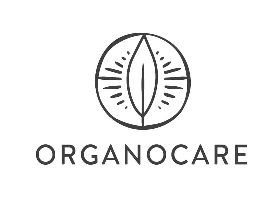
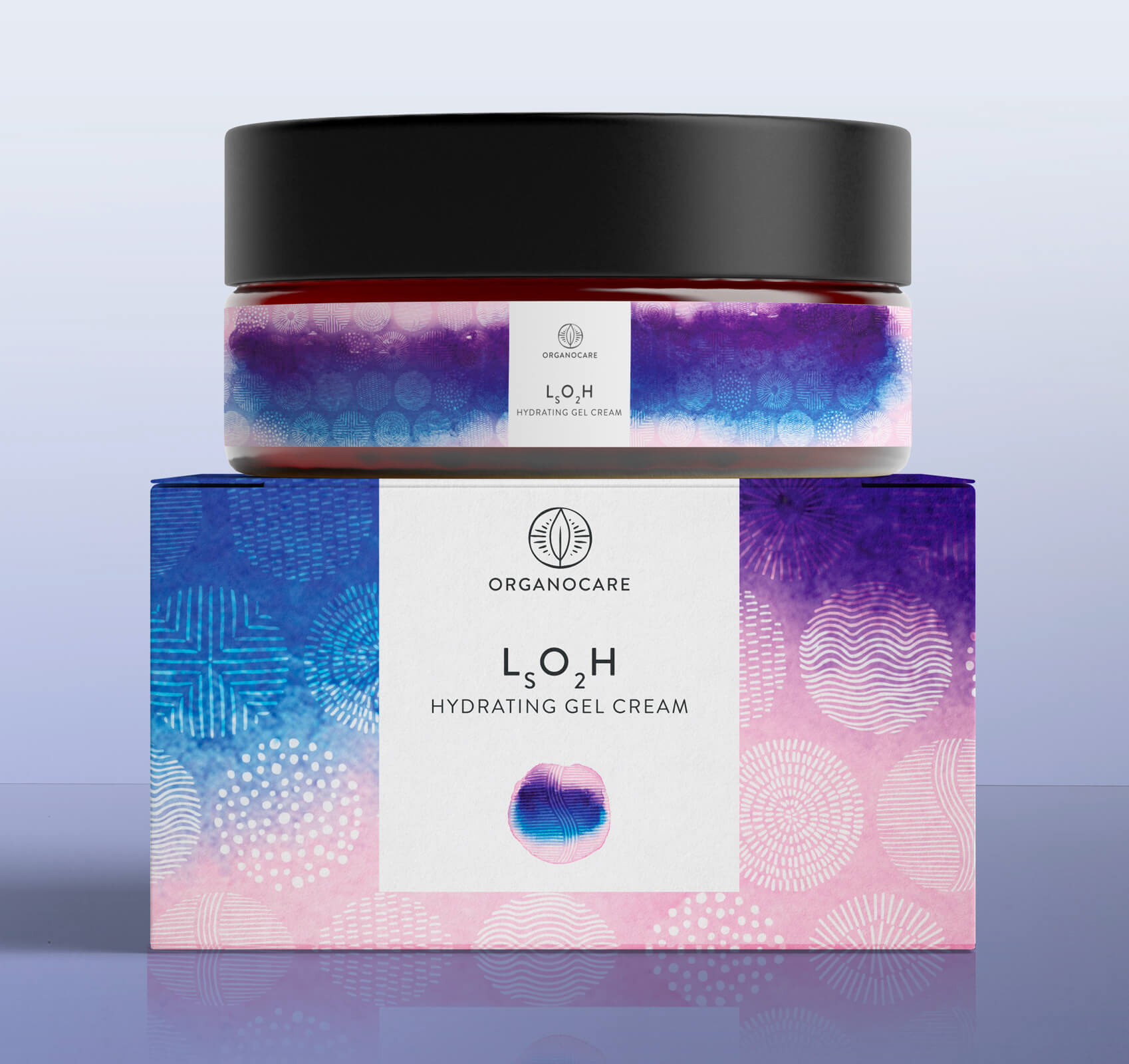
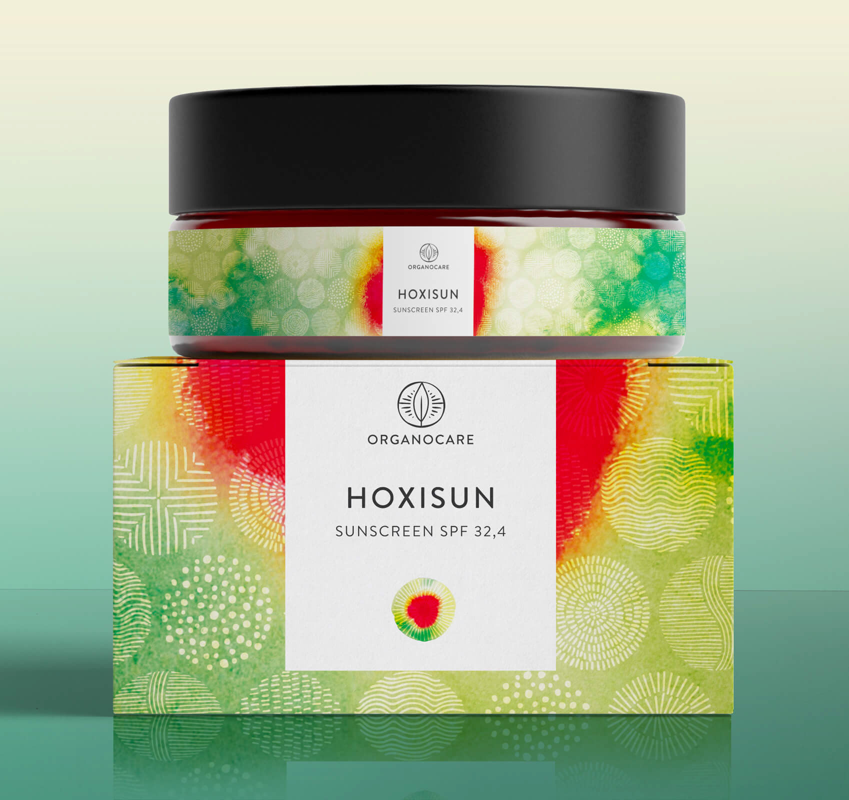
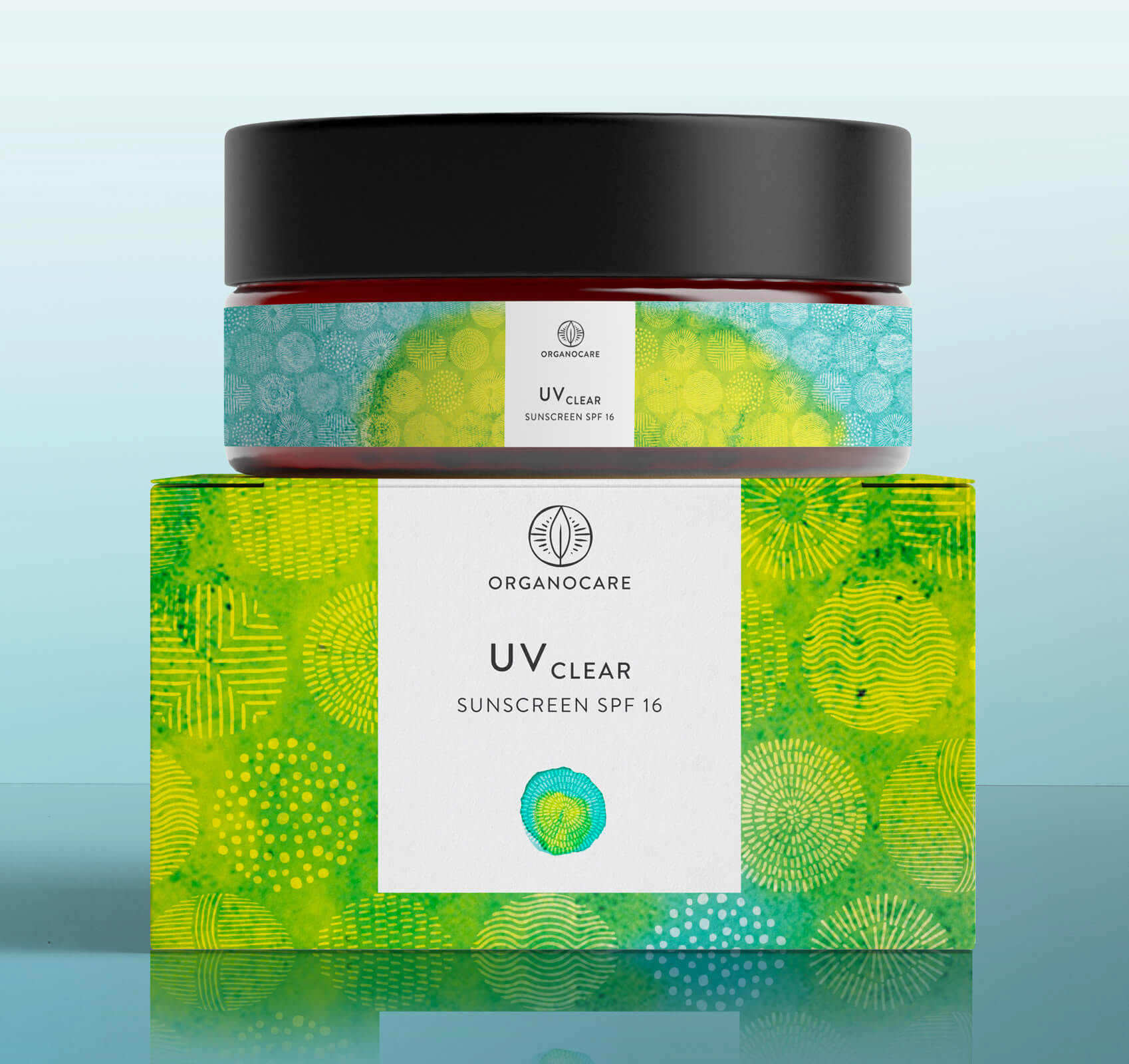
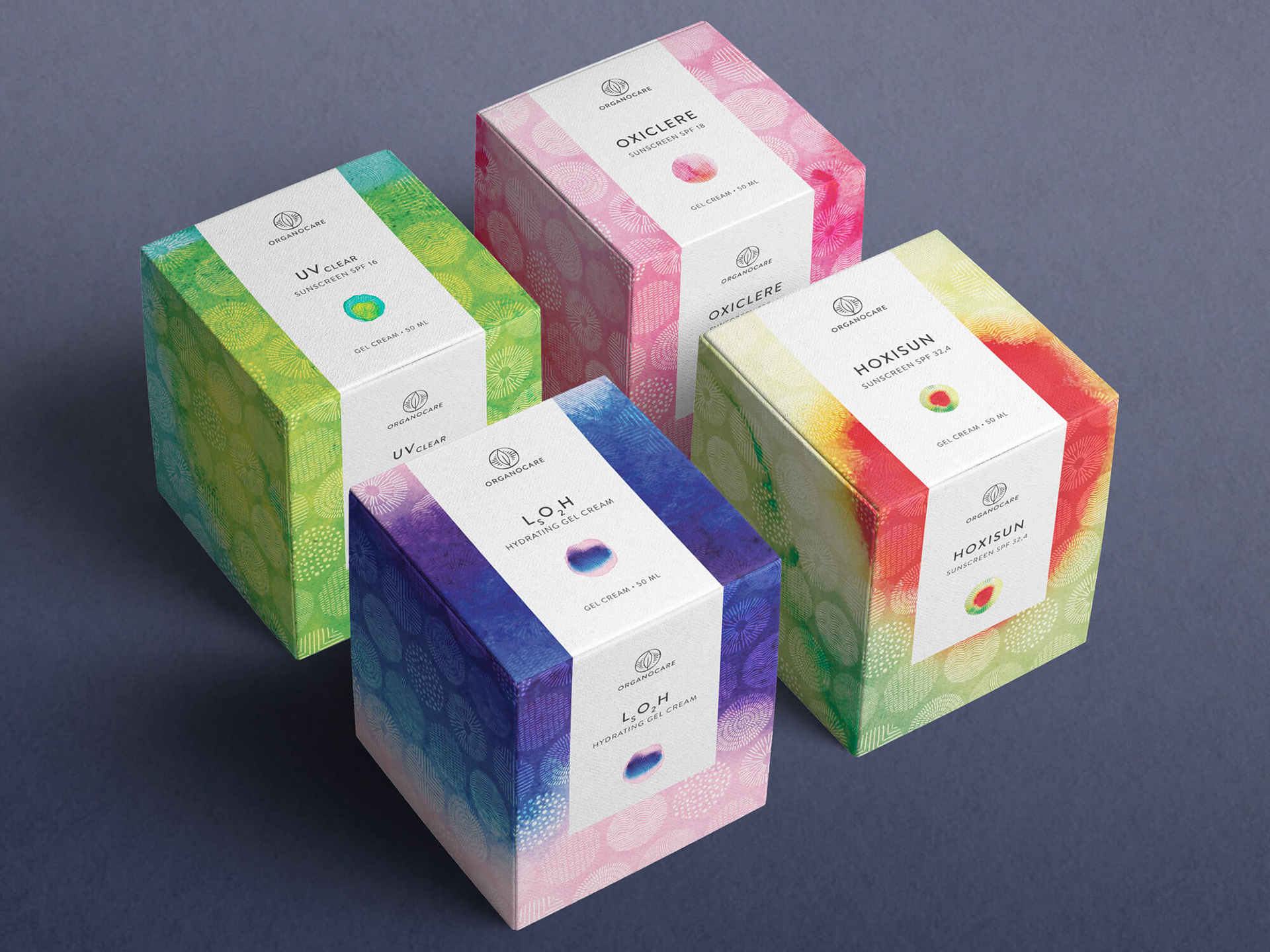
Design option 3
The logo represents the “O” of Organocare and includes a leaf. It reminds of the shape of an eye that sees through the plants to look for their powers. It conveys natural source, knowledge, science, friendliness and accessibility.
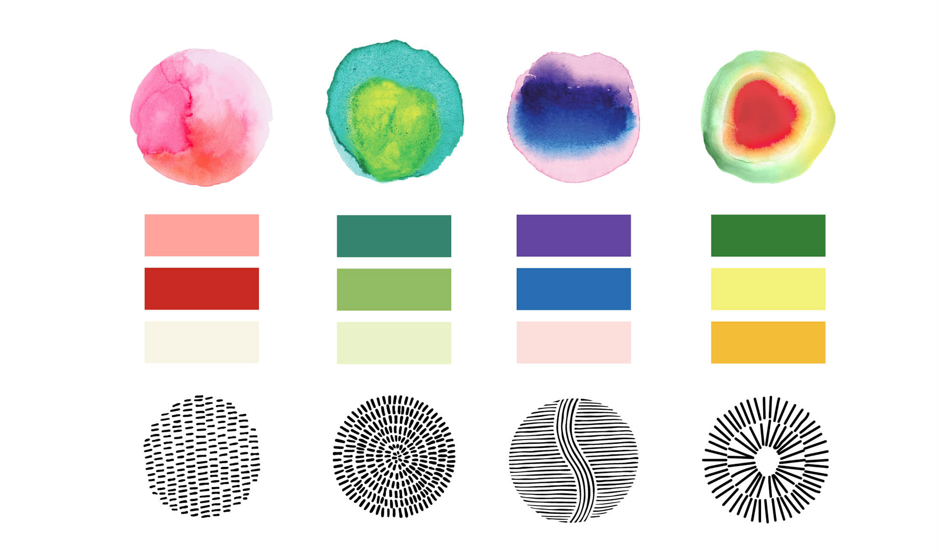
For this design option, I used patterns found on different items (clothes, fabrics, shield, etc.) in South Africa as well as watercolour marks. Each product is represented by a specific pattern and watercolour combination. I hand illustrated the logo and patterns, to expand upon the brand’s lively, natural and human qualities. The label reminds of the colourful and cheerful traditional clothing of communities.