Client projects — Ferris.ai
Data and AI-driven solutions delivered on real-time platforms
Visual identity
UI/UX Design
Web development (WordPress)
In collaboration with Making You Smile Agency
Ferris.ai is a leading data and AI company based in Switzerland. The company accelerates digital transformation with data and AI solutions and consulting (backed by real humans!) on real-time platforms.
With many years of expertise but an unclear message and out-dated image, the company wanted to achieve new goals that reflect their new ambition. The aim of the project was to gather all platforms and information about Ferris into a single website to make information clearer for customers and visitors as well as increase interest in business and spread word about the its products
and solutions.
To meet these expectations, I worked in collaboration with Making You Smile to provide a creative solution that makes the brand stand out and bring clarity to Ferris’s business, positioning and message.

Visual identity and UI/UX Design
A clean, refined, ambitious and value-driven image
The first objective was to make the visual identity and new website modern while highlighting the company’s years of expertise.
The website combines dark and light mode with touches of vibrant colours and bold elements and layout. The colour palette is dominated by vibrant and energetic red and orange, which are often associated with passion, confidence, enthusiasm and creativity. They also brings warm, youth and friendliness adding a human touch to the overall feel. I incorporated visual elements such as hand-drawn illustrations and animations to enhance the user experience.
Secondly, to achieve clarity and order and create clean, easy-to-absorb content, I used a grey lines grid that acts as the backbone of the website.
The outcome is a visually stunning website and gives a clean, refined, ambitious and value-driven look & feel.


Worpdress Development
Engaging experience
I developed the website into WordPress integrating micro-interactions and animations to grab the audience’s attention, encouraging them to explore the platform’s wealth of content and drawing the eye to important information or CTA. The design of the buttons is bold and original using the square shape of the logo to highlight the element.
The website was also thoughts for mobile and tablets users without sacrificing the beauty of the final product.


Love notes

Groupe La Mère Poulard

klein • wenner wishes you a year of peace

2022 Sea Life Calendar
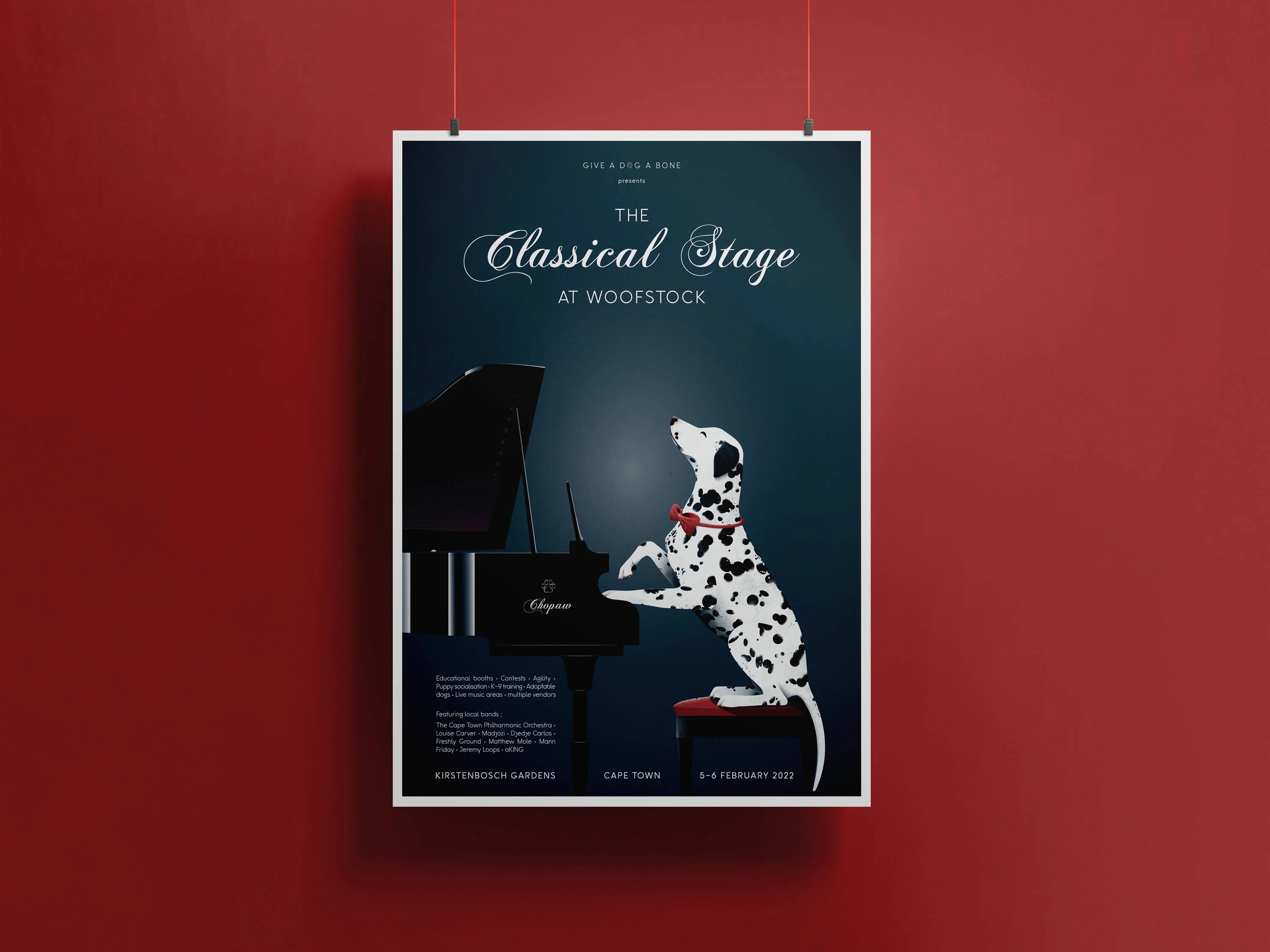
Woofstock Festival
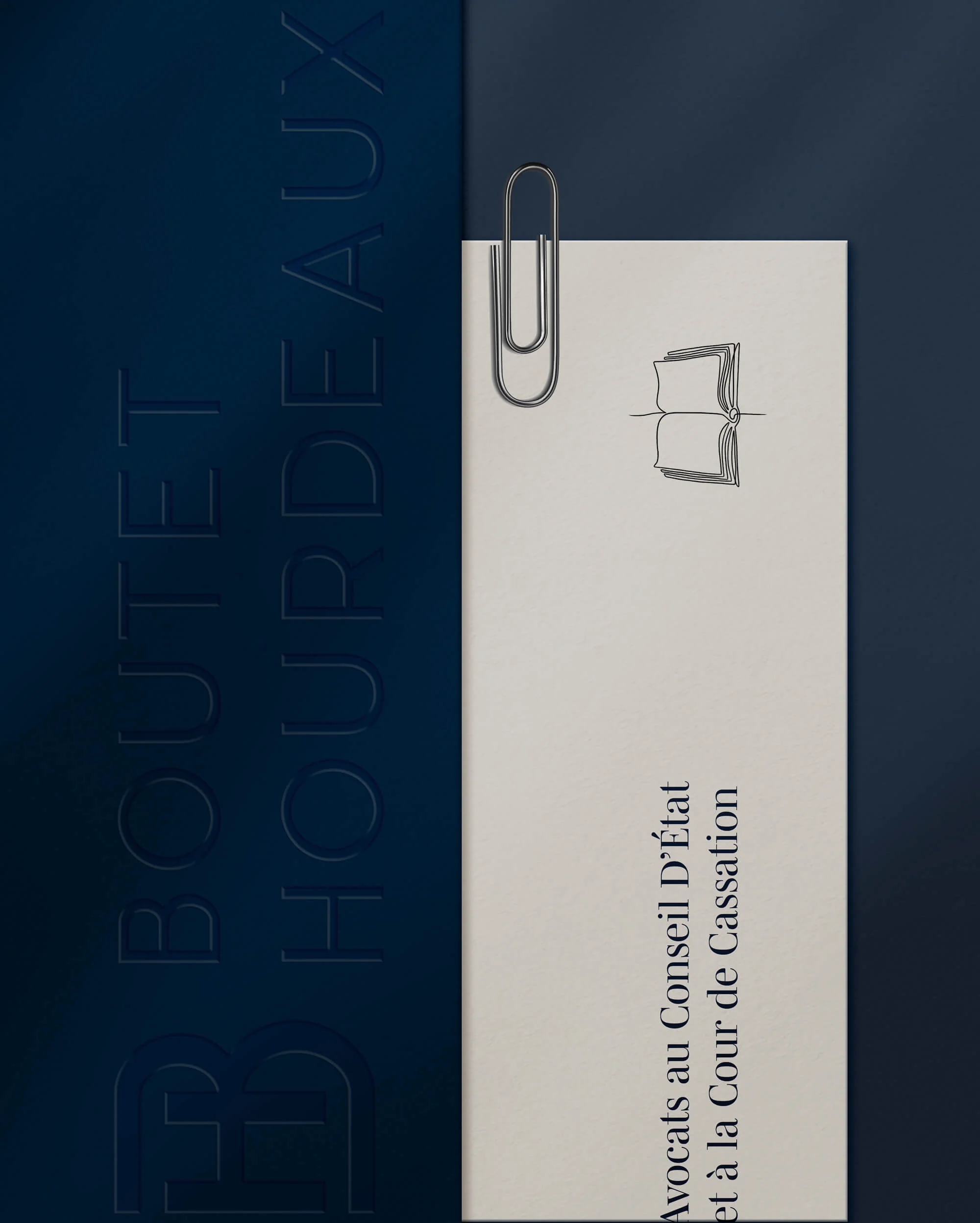
Boutet-Hourdeaux, Supreme Courts Attorney
