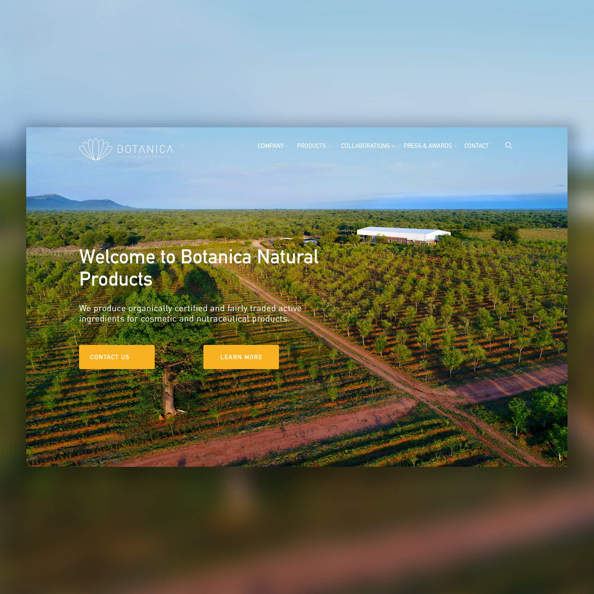

Timola is a proudly South African Health and Beauty brand. Their mission is to source and bring the natural vitality of Africa's cosmetics and superfoods for skin, hair and body. TIMOLA is a sePedi (Northern Sotho) word that means “to soothe”. Most of their product ingredients are organically grown by small scale farmers in South Africa.
Back in 2016, when the brand was still owned by Botanica Natural Products, I created a first design in monochrome colour highlighting the main tree or plant the oil is from. Then in 2018, Timola stood on its own two feet and decided to redesign its range of oil packaging keeping the idea of the main plant/tree but adding a more premium look. I also designed a secondary packaging showing the illustrations of the plants used in the oils.
Each plant is digitally illustrated and appear on the website, branding and packaging. The botanical illustrations expand upon the brand's values lively, natural & human qualities.
You can see all the illustrations I created for Timola here.
CLIENT
Timola - South Africa
PROJECT DATE
November 2018
CATEGORY
Packaging · Illustration
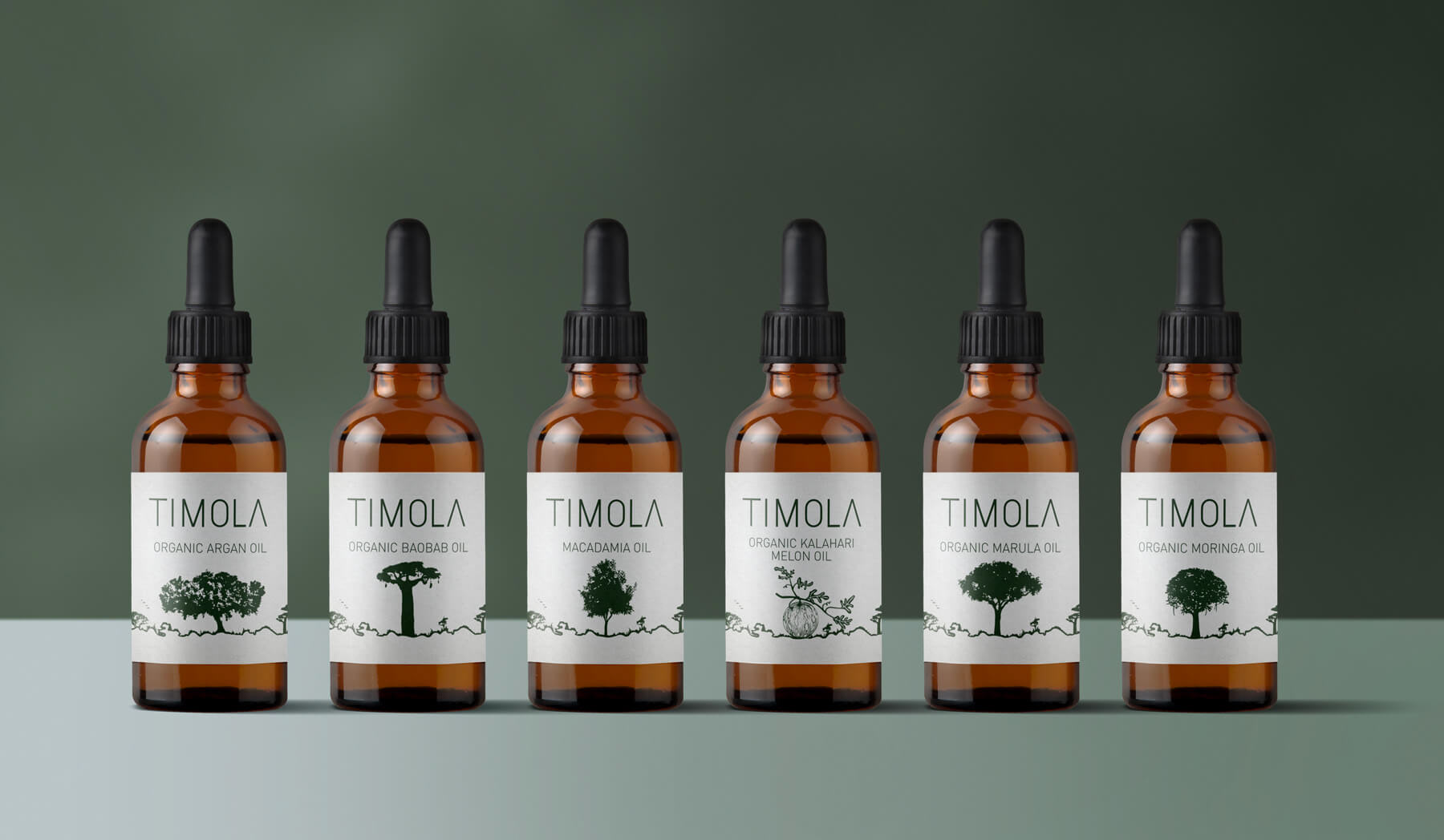
2016: First design in monochrome colour highlighting the main tree or plant the oil is from.
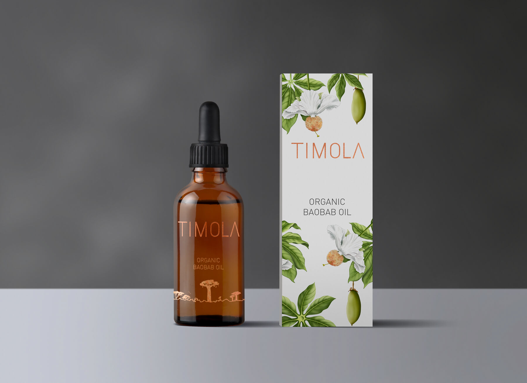
2018: new design for the range of oils - Organic Baobab Oil
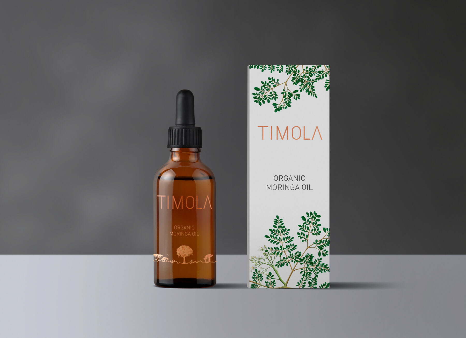
2018: new design for the range of oils - Organic Moringa Oil